Senior Program Manager, Microsoft DevRel — 2025–2026
Awesome Copilot
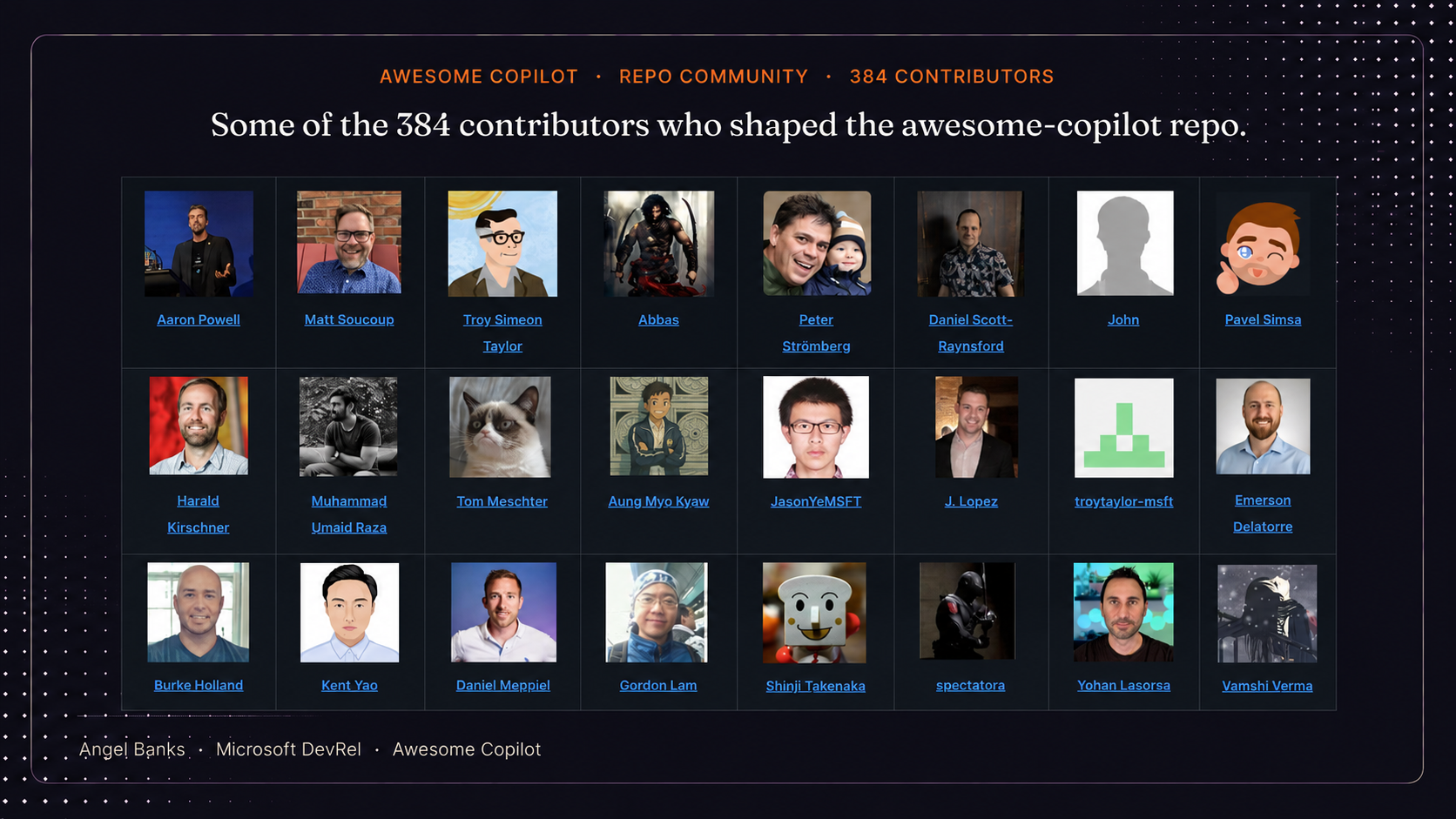
Launched the Awesome Copilot repo (custom instructions, reusable prompts, chat modes) and Learning Hub, scaling to over 1 million page views in the first full month after launch with 384+ contributors.
Timeframe: Repo launch: July 2025. Public website with Learning Hub feature: launched week of March 9, 2026.
See it liveAwesome Copilot website GitHub repo

Context
GitHub Copilot was rapidly becoming a daily-driver tool inside developer workflows, and the questions it generated — "what's the right prompting pattern for this language?", "how do I demo Copilot in an enterprise context?", "where can I send a customer to actually learn this?" — were landing in DevRel inboxes across every team in Cloud Advocacy.
The information existed. It was in scattered blog posts, individual team wikis, one-off Twitter threads, and demos buried inside conference recordings. What didn't exist was a single, curated place where a developer, internal or external, could go to find the canonical, production-quality patterns for working with Copilot.
Starting state
- High-quality Copilot content existed across the org, but was scattered and inconsistent in format.
- DevRel teams were independently building demos and prompting examples, often duplicating work without realizing it.
- No shared signal of what "good" looked like. Every team set its own bar.
- Customer and community questions were getting answered ad hoc by whichever advocate had the deepest context that week, which didn't scale.
- GitHub had excellent product documentation, but the gap was in applied patterns, examples, and learning paths — the connective tissue between "what Copilot does" and "how a real developer uses it well."
Goals & success metrics
The program had two phases with distinct goal sets.
Phase 1 — Repo launch (July 2025). Goals:
- Consolidate — pull the scattered work into one curated, browsable resource.
- Set the bar — establish quality standards for what an Awesome Copilot example looks like (clarity, applicability, prompting hygiene, real-world relevance).
- Make it discoverable for both internal advocates and external developers, so the same resource served both audiences.
- Iterate as a hub, not a list — evolve from a flat catalog into an actual learning surface as the community fed in new patterns.
Repo primary KPI: Unique visitors per day during July, with page views tracked as a secondary surface metric. Targets were partially informed by comparable repos in the ecosystem — awesome-azd and ai-app-templates — which gave us a realistic baseline for what "healthy" looked like at this stage.
Repo secondary KPI: Unique community-contributed content volume by mid-July. Content volume mattered because it was the most direct signal of an engaged ecosystem — a repo only stays useful if the community is actively making it better.
Unique visitors was chosen as the primary metric because it was the OKR metric being tracked across DevRel. Keeping Awesome Copilot's success criteria aligned with the org-wide measurement framework made it easier to compare against peer programs and roll up cleanly into the broader DevRel scorecard. GitHub repo analytics surfaced two metrics at the time — page views and unique visitors — and unique visitors was the cleaner proxy for distinct developers reached, which is what the OKR was designed to measure.
Phase 2 — Public website with Learning Hub feature (week of March 9, 2026). Goals:
- Solve the navigation problem the repo had outgrown. The repo launched with three content categories (custom instructions, reusable prompts, and chat modes) and expanded over time to seven (Agents, Instructions, Skills, Plugins, Hooks, Agentic Workflows, and Cookbook). The README — fine as a navigation surface for three categories — became overwhelming as the surface area more than doubled. We knew we needed a real website for navigation before we could responsibly add another major feature on top of it.
- Add a Learning Hub feature — turn the curated content into guided learning paths inside the site, not just a browsable index. The Learning Hub launched with four tracks deliberately structured for different learning modes: Fundamentals (concept tracks like What are Agents, Skills, and Instructions and Agents and Subagents), Reference (quick-lookup resources like the GitHub Copilot Terminology Glossary), Hands-on (interactive samples in the Cookbook), and Copilot CLI for Beginners (a text-based path plus a companion YouTube video series). Critically, the website-for-navigation work had to ship first, because shipping the Learning Hub on top of an already-overloaded README would have made the navigation problem worse, not better.
- Make the resource discoverable beyond GitHub — meet developers who weren't already on GitHub by giving Awesome Copilot a public web home.
- Preserve the contribution model — the repo continued to be the source of truth; the website surfaced and structured it.
Website primary KPI: A first-week page-view target, with a sustained weekly target through end of Q2.
Scope & constraints
- Scope: Cross-team, internal-and-external. Awesome Copilot needed to serve DevRel as a tool and be linkable to customers and community.
- Resourcing: No dedicated team. I drove the program structure, the curation rubric, the information architecture (for both the repo and the eventual website), and the iteration cadence. Contributing teams supplied the content.
- Constraint: Could not duplicate or compete with GitHub's official Copilot documentation. The hub had to live in the applied patterns layer above the docs.
- Constraint: Quality bar had to stay high even as contribution volume grew — the value of the resource was the curation, not the volume.
- Constraint (Phase 2): I left Microsoft the week before the website with Learning Hub launched. The launch plan, success criteria, and operating model all had to be documented well enough that the team could execute without me.
Approach
I treated Awesome Copilot as an iterative product across four phases.
Phase 1 — Gap discovery.
Cataloged what existed, where it lived, and what was missing. The exercise surfaced the obvious gaps (no shared enterprise demo, no canonical prompting patterns by language, no entry-level learning ramp) and the less-obvious ones (no consistent attribution model for where contributions came from).
Phase 2 — Centralized resource (repo).
Built the initial centralized version: a curated, structured repo where each entry followed a consistent shape (problem → pattern → example → notes). The structure was deliberately opinionated so contributions stayed comparable rather than collapsing into a link dump. I worked with the team to shape the repo's information architecture — content categories, naming conventions, contribution intake, and the relationships between categories. I provided the IA guidance and decision framework, knowing the structure would have to absorb new content types as Copilot's surface evolved.
Phase 3 — Learning hub iteration (in-repo).
Iterated based on how DevRel and developers actually used the resource. The pattern that emerged: people weren't just looking up examples — they were looking for a path through the examples. So the in-repo experience evolved from a flat catalog into a learning surface with curated pathways, leveling, and explicit "start here if you're new" entry points.
Phase 4 — Public website with Learning Hub feature.
The repo had proven the demand and the contribution model — but it had also outgrown its own navigation surface. What launched with three content categories (custom instructions, reusable prompts, chat modes) had expanded to seven (Agents, Instructions, Skills, Plugins, Hooks, Agentic Workflows, Cookbook), and the README — the only navigation layer the repo had — was no longer doing its job. The website was a navigation problem before it was a discovery problem.
That sequencing mattered: we needed a real website for navigation first, then the Learning Hub could ship on top of it. Trying to add the Learning Hub to an already-overloaded README would have buried the new feature inside the same scrolling problem we were trying to solve.
This phase was also where the information architecture got reworked end-to-end. The repo IA had served its job for three categories on a README. A seven-category website with a Learning Hub on top of it needed a different IA — a top-level navigation that made the categories legible to a first-time visitor, a clear separation between browse (the catalog) and learn (the Learning Hub tracks), and a content model that let the same repo entry surface in both places without duplicating maintenance. I worked with the team on that IA in lockstep with the launch plan, providing the structural framework and category logic, and it's the layer that made the Learning Hub feel coherent rather than bolted on.
So Phase 4 actually delivered three things at once: a public Awesome Copilot website with structured navigation across all seven categories, a new Learning Hub feature with four tracks tuned to different learning modes (Fundamentals concept tracks, a Reference glossary, a Hands-on Cookbook, and a Copilot CLI for Beginners path with a companion YouTube series), and broader discoverability for developers who weren't already on GitHub. The GitHub repo stayed as the contribution source of truth; the website became the structured surface on top of it.
The website with Learning Hub launched the week of March 9, 2026 — the week after I left Microsoft. I designed the launch plan, KPIs, and operating handoff before leaving, and the team executed against that plan.
Decisions & tradeoffs
Decision 1: Curated quality vs. open contribution volume.
The cheapest version of this would have been "let everyone add anything." That would have produced volume fast but degraded the quality signal that made the resource useful in the first place. I chose curation with a defined quality bar — accepting that contribution would feel slower — because the entire value proposition was that someone had already done the filtering for you.
Decision 2: Curation-only vs. community contribution from day one.
The audience was always the developer community. That wasn't in question. The real decision was whether to launch as a curated showcase (Microsoft-published patterns the community could read) or as a contribution surface from day one (where the launch messaging actively invited the community to submit their own custom instructions, reusable prompts, and chat modes). Curation-only would have been faster and lower-risk. It also would have been a publication, not a community.
We chose contribution from day one and built it directly into the launch messaging. The repo wasn't just a place to find good Copilot patterns, it was a place to send yours. That decision is what made the contribution numbers a real signal later: 108 community-contributed pieces and 384 contributors didn't happen because we eventually opened the door. They happened because the door was the entryway from the beginning.
Decision 3: Flat list vs. learning paths.
The first version was a flat catalog. The iteration to learning paths added complexity and ongoing maintenance cost, but it converted the resource from "search-and-find" into "guided ramp," which materially changed how new developers used it. That decision laid the groundwork for the Learning Hub feature on the website.
Decision 4: Full website vs. GitHub repo for v1.
My initial instinct was to launch Awesome Copilot as a full website — branded, polished, integrated with the broader Microsoft developer surface. But a website required leadership approval (brand, infrastructure, and developer-surface alignment), and that approval cycle would have stretched the timeline by months. Meanwhile, Copilot features were rolling out fast enough that delay would have made the resource feel late.
The repo had no equivalent gate. I could ship it without standing approval, with the same IA and contribution model I'd have used on a website. So I reframed the question: what's the core problem we're solving? Getting useful Copilot resources into developers' hands quickly. The repo solved that with none of the website's approval overhead. We launched as a repo to start serving developers immediately while the website approval path was being worked in parallel, and let real usage from the repo do the work of justifying the website investment.
The tradeoff was that a repo is less discoverable to non-GitHub-native developers, and the visual polish ceiling is lower. But shipping in weeks instead of months was worth more than either of those, especially for a launch where the audience was already on GitHub anyway. By the time we did launch the website with the Learning Hub feature, the demand signal was unambiguous, the IA was battle-tested by repo users, and the leadership case wrote itself.
Decision 5: Documented handoff vs. delaying the launch.
The website with Learning Hub launch landed the week after I left Microsoft. The path of least resistance would have been to push the launch out so I could be there for it. I chose the opposite: keep the launch on its committed date and invest the runway I had into a documented launch plan — KPIs, week-of operating cadence, content cutover, Learning Hub structure, contributor onboarding, escalation paths — so the team could execute without me.
The tradeoff was that I wouldn't be on the ground to improvise if something unexpected hit. The upside was that a launch built on documented operating decisions is a stronger program than one that depends on a single person being in the room. The team followed the plan, executed on most of it, and absorbed a few infrastructure hiccups in stride. The program shipped on time and beat the sustained traffic target by a wide margin, which is the truer test of whether the operating model was real.
Outcome
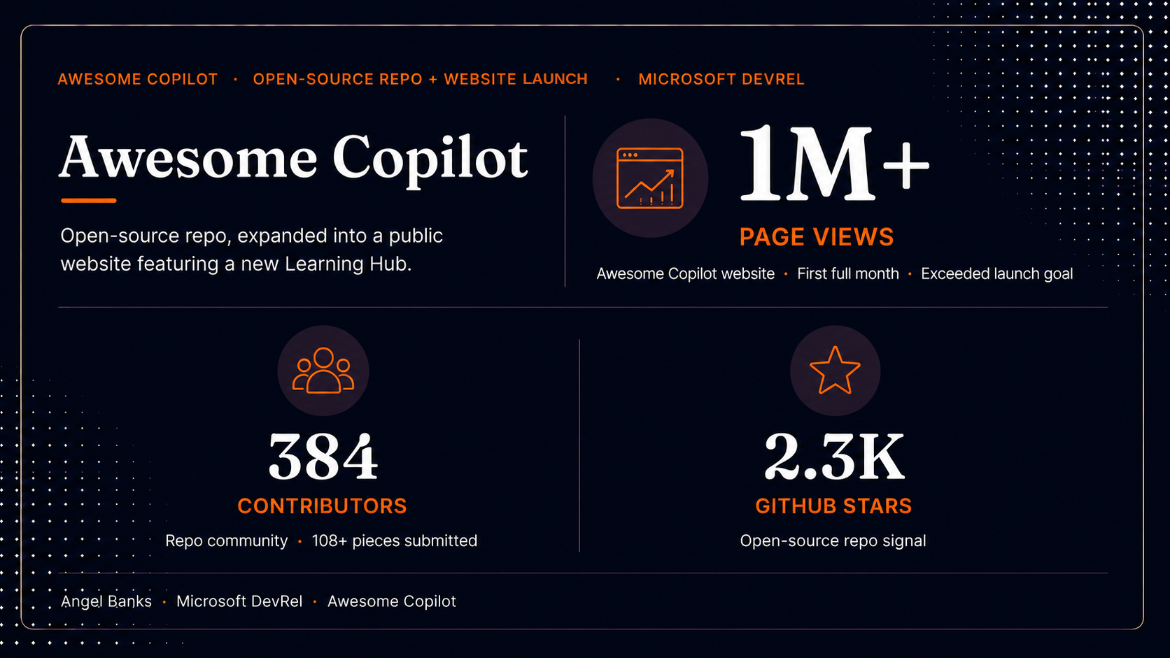
Repo phase (data through 7/11/2025, 10AM PDT):
- Unique visitors and page views — both ran well ahead of monthly targets on the primary OKR metric and secondary surface metric.
- 108 community-contributed pieces of content — 32 chat modes, 36 instructions, 40 prompts. Started with ~20 at launch and grew steadily through July.
- 2.3K GitHub stars and 224 forks — community signal that the resource was being adopted, referenced, and built on.
The initial spike was driven by an announcement blog and social promotion, but the most encouraging pattern was that work-week traffic kept trending up rather than tapering after the launch buzz — the strongest signal that the repo was being used as a working developer resource, not just a launch-day curiosity.
Website with Learning Hub phase (launched week of March 9, 2026):
- First 7 days: A soft launch week that came in slightly under the first-week goal as initial infrastructure stabilized.
- First 30 days: Hundreds of thousands of page views — accelerated past the early-week pace as discovery and Learning Hub usage compounded.
- April 2026 (first full calendar month): over 1 million page views — more than double the sustained launch goal, held across the entire month.
- 384 contributors to the underlying repo across the program.
- Launch coverage on Microsoft and GitHub's own surfaces — the Microsoft Developer Blog (Matt Soucoup, Awesome GitHub Copilot just got a website and a learning hub and plugins) and GitHub on X — distributing the launch through the highest-leverage first-party channels available to the program.
The honest read: launch week came in slightly under the first-week goal, then the program accelerated past the sustained goal across the following month. Exactly the pattern you want from a launch where the underlying value proposition is real but the surface is new.
Reflection / What I'd do differently
The clearest lesson from Awesome Copilot was that a curated resource is a product, not a publication. The first version was a publication — ship it, link it, done. It started getting real traction only when I treated it as a product with a roadmap, a quality bar, a contribution model, and a feedback loop with the people actually using it.
The shift from flat catalog to learning hub also taught me that for AI tooling especially, developers don't want a list of capabilities — they want a path. That insight is what made the Learning Hub feature on the website land. By the time we shipped it, the structure had already been validated by how repo users were navigating the content.
The handoff lesson from the website with Learning Hub launch was equally important: design the program so it's executable without you. The launch happened the week after I left, and it shipped on plan because the operating model — KPIs, cadence, structure, contributor onboarding, escalation paths — was documented well enough that the team could execute against it instead of recreate it. Programs that only run when their PM is in the room are fragile programs.
If I were doing this again, I'd:
- Build the learning-path structure into v1 instead of discovering the need through usage data.
- Define the contribution model and quality rubric before opening contributions, not in response to them.
- Stage the website launch's traffic ramp more conservatively in the first week. The first-week target was set against a launch playbook that didn't fully account for how the discovery surface would warm up. A more conservative week-one target with the same monthly ceiling would have read as a cleaner trajectory externally.
- Keep the operating principle that made this work in the first place: build v1, launch, get feedback, iterate — and pair it with the operating principle that made the website launch work without me: document the program well enough that it can ship without its PM in the room.